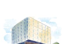
“I feel like I’m in a psychology experiment whenever I go to PAS,” I’ve been told more than once. The Psychology, Sociology and Anthropology (PAS) building was designed to resemble a human brain, a feat achieved through the placement of curving corridors and redundant staircases. The design was originally planned by two professors on the back of a cocktail napkin, and eventually executed by the architecture firm behind the CN Tower, Webb Zerafa Menkes Housden.
Professor Micheal Dixon, who conducts labs on the lower two floors, sees the building “as more akin to the design of a rabbit warren.” The description is more than fitting historically, as it seems much of the “psychology research” in the swinging seventies was seeing how much you could subject a monkey to. As such, the 1969 floor plan included separate laboratories for primates, marine animals, and human infants. Non-porous walls “prevent[ed] vermin from invading.” Special consideration was made for all kinds of noises: squeals from the primate facility, the buzz of fluorescent lights, and the inevitable click-clack of a woman’s plastic heels down the corridor “which requires control in any behavioural research area,” according to the building report. The muting effect of the building feels more like an intangible aura of dampness as you scurry from class to class. “I teach a psychophysiology class down there – a very narrow room filled with computers and physiology equipment,” Dixon said. “The room used to house Mongolian Gerbils, but now is a windowless teaching space. The lack of windows in some of the grad student spaces is problematic for their mental health, yet they persevere!”
Fifty years after its construction, I find myself circling the central staircase like some undiscardable thought, occasionally bumping up against strangers looking for an elevator, or room 1309 — something I cannot help them with. When I finally find a water fountain, it bubbles up a quarter-inch of spinal fluid before dribbling out pathetically. I get lost twice on my way back to class.
Unlike other buildings on campus, which have an implied flow, from hard corners and corridors, PAS is built around symmetries, curves, and harsh jagged lines. It is not composed of similar, regularly-shaped rooms, and entrances are scattered around the perimeter, so there is no linear flow of traffic. PAS can be navigated through the use of the bright, geometric prints which appear as sudden as an epiphany, taking up most of the space at the end of a hallway.
Christine Purdon, a professor working in the PAS building, told me: “That there is no real main entrance continues to bother me, but the unconventionality of the space has grown on me… I have heard many stories over the years about the building’s concept and wasn’t sure if there was truth to the claim that it was designed to resemble a brain, but I take your word. I guess if you are inside a brain you may lack a coherent picture of the space and its function, toiling in your own area while experiencing a lot of confusing twists and turns; maybe that is the exact metaphor for academia!”
What does it mean for a building to have no real centre, or linear flow of traffic? It can be frustrating — like you’re an unwilling participant in an experiment or trapped in a dungeon, especially if you’re only ever wandering the building in a rush to and from class. But I think what the building lacks in ease of navigation it more than makes up for in its space for wandering. In a world where so much must be achieved in a linear, efficient fashion, PAS — for all its frustrations — stands apart as a space that does not intend to be quickly or efficiently navigated.
Classrooms themselves may feel distorted or unfocused. In room 1229, students face each other, sitting on one of six tables. Lecture slides are projected onto television screens, a few on each wall. In these classrooms, students are able to have conversations they couldn’t have in a theatre-style lecture hall, and change their focus as they please.
Similar to PAS, casinos are famously unnavigable. They often employ PAS-like curving corridors. Casinos avoid 90 degree angles, according to anthropologist Natasha Dow Schüll in her book Addiction by Design, because any decisions in navigation (like should I turn left or right?) may prompt casino guests to leave.
The connection to PAS and casinos doesn’t just end there. “On the first floor is our gambling lab, where we have slot machines, video games and psychophysiology equipment. Here we do research to try and uncover what makes gambling and gaming so addictive for a small subset of people,” Dixon said. “Through understanding the addictive elements we can then conduct research exposing deceptive elements of slot machine and video game design, and to ultimately guide policy changes to minimise gambling harm.
“Like a casino, there are no windows, and no clocks. It is a great space for doing research. I am always conflicted about how I feel going into this space. We have often had people with severe gambling addictions come into the space to share their experiences — experiences that have been incredibly influential in helping guide our research on what we call ‘dark flow’ and what they would call ‘the slot machine zone.’ Their stories are heartbreaking. Yet, also in this room I have a wall celebrating student successes. Pictures of my award winning grad students, their first-authored papers celebrating their myriad accomplishments. I cannot help but smile when I look at that wall.”
In The Poetics of Space, Gaston Bachelard professed corners and closed-off spaces to be places for imagination and daydreaming: “Every corner in a house, every angle in a room, every inch of secluded space in which we like to hide, or withdraw into ourselves, is a symbol of solitude for the imagination; that is to say, it is the germ of a room, or of a house.” PAS is filled with semi-secluded spaces — benches are built in hallway recesses, hidden entrances are accessed via staircases reaching down into the hillside, vestibules shield office doorways from the flow of traffic — the building is teeming with corners to think or wait in.
These closed-off spaces don’t have to be solitary, though. The roof provides a lovely view of campus to share, while the sunken courtyard is outfitted with a long picnic bench, places fit for loneliness or intimacy or careless fun in a group. Purdon said of the foyers in front of offices, “In PAS most of the offices around the outer perimeter of the building have a foyer, so the doors do not open directly into the hallway. I find this affords a much more peaceful working space. We have chairs in the foyers so people can wait comfortably outside our offices, which I think offers a more inviting air. When we drop in on each other there is a bit of a sense of “visiting” and “hosting” in our offices which feels very collegial.” Dixon shared similar stories of social gatherings in PAS, “The patio in the centre of the building is a wonderful feature. We have had many departmental celebratory lunches in this space. For years every spring, a female goose chose to lay her eggs in this space, and every year we have had to call Nancy Gibson (one of our amazing staff — an award winning veterinary technician) to remove her as they get quite aggressive.”
Despite its unconventional layout and disorienting design, PAS offers a sanctuary for intellectual exploration and communal engagement. As students continue to navigate (and lament about) its winding corridors, PAS remains a testament to the boundless possibilities and of the human mind.


