On Aug. 24, 2015, the department of athletics and recreation at UW announced that Nike would be the official provider for all Waterloo Warriors apparel. The statement also stated that “Nike will be the sole provider of standard issue apparel for all 32 Waterloo Warriors varsity programs.” Before Nike came into the picture, there was no standard for varsity uniforms. The basketball and soccer teams had Adidas jerseys, the football team already had Nike jerseys, and Russell Athletics sold Warriors branded shorts in the campus store. With Nike at the helm now, all jerseys will be sporting the iconic swoosh, and with a change in brand also comes a change in design. Here are my top five uniforms:
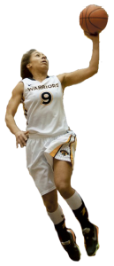
Overall, this jersey is plain. “Warriors” spelt out in all-caps with black letters and a gold outline followed by the player’s number in the same typeface. The only reason I included the women’s basketball team jersey in this list are the shorts. These shorts are like no other. The side of the shorts have a black triangle with a gold outline. Inside the triangle are black polka dots. POLKA DOTS. This subtle addition gives the shorts a retro feel. I can imagine NBA players from the ‘90s wearing them. The shorts are finished off with the Warriors logo resting on top of the polka dots. I want a pair.
4 . Men’s golf
 Typically I’m not a huge fan of colour-blocking on any shirt but the men’s golf team polo shirts make it work. The torso area of the shirt is partitioned into three parts: two yellow sections that are split by a white line and a white bottom section. The Warriors and Nike logo lay atop the chest area. A white collar and white sleeves round up the polo shirt. The shirt is tucked into a pair of black pants held up by a crisp white belt. The beauty of this uniform is that players have the choice of which belt buckle and fit of pants they would like to sport. I would prefer if players wore more tapered fitting pants. Throw on your favorite dad cap and you have an outfit that can be worn on and off the fairway.
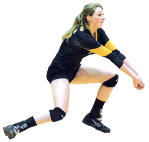
This jersey makes no sense from a functional standpoint. In a sport that requires constant rotation of the shoulders, having sleeves can restrict that movement. Two years ago, the NBA released sleeved jerseys and many players complained. The men’s volleyball team does not have a sleeved variant. Not only do the women’s volleyball team have a sleeved variant, they have long sleeves. Ask any volleyball player and they will say that bumping a volleyball while wearing a long sleeved top can obstruct accuracy. This is why many players will roll up their sleeves. Aesthetically speaking though, these jerseys are straight fire. The black top with black short shorts, black knee-pads, and small Warriors logo provides an overall very minimalist but intimidating look. The main attribute that pushed this jersey over the edge for me was the yellow accent on the sleeves. They really chose form over function with this jersey.
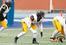
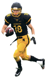
Head-to-toe, I feel like this is the most complete and clean uniform, and it encapsulates the black and gold spirit. The matte black finish, gold caging, and Warriors logo make the helmet a beautiful piece. The all black jersey with gold accents on the sleeves are dope. The top is rounded out with “Warriors” spelt out in a clean typeface and the player’s number on his torso and shoulders. My favorite aspect of the jersey is the grey pattern on the neck lining that surrounds a gold Warrior head silhouette contained within a shield-like shape. The all gold tights are a really nice contrast to the black top. The Warrior head silhouette and black stripe going down the side lessen the vibrant tights. The whole uniform is completed with a black belt.
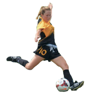
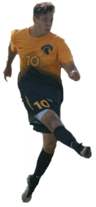
The freshest of the fresh. The jersey has a gold upper half with the Warriors logo emblazoned on the player’s left side of their chest. The back of the jersey is all-black. Now what really sets this jersey apart: it transitions from a triangular-line pattern with the player’s number in front — the lines increase in size that causes a gradient effect which leads to the all black bottom half. Very aesthetically pleasing to the eyes. The black continues onto the shorts with the player’s number on the right thigh area in gold, with a gold line on the side of the shorts that gives it a clean finish.
And the most lackluster uniform goes to….
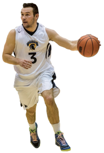
It is odd. Nike has become synonymous with basketball. Nike sponsors NBA legends like Michael Jordan, Lebron James and Kobe Bryant. And yet, the men’s basketball team jerseys are so … plain. There is really nothing special about them. Here we have an all-white jersey with the Warriors logo front and centre and the player’s number underneath the logo. The shorts are all-white, with a black stripe on the side and a black silhouette of a Warriors helmet. And that’s it. They could use some polka dots.


